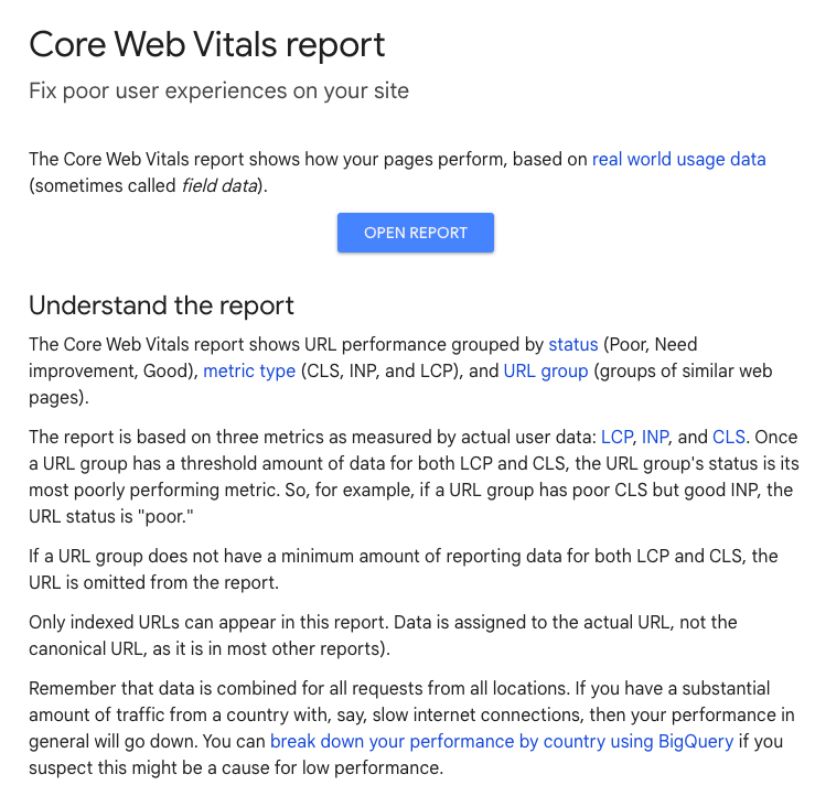
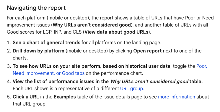
Cumulative Layout Shift (CLS) is a vital metric in Google’s Core Web Vitals, which focuses on the visual stability of web pages. This metric quantifies the unexpected shifts in layout that occur as content loads asynchronously, causing elements to move around the page. These shifts can be frustrating for users, often leading to poor user experiences and accidental clicks on unintended elements. It’s just downright frustrating for your site visitors and ruins the user interaction.
In this article, we’ll break down how to fix your cumulative layout shift score. We’ll cover what CLS is, how it’s measured, and strategies for optimizing it to enhance your website’s performance.
What is CLS?
Cumulative Layout Shift (CLS) is a crucial metric used to measure the visual stability of a webpage. It quantifies the extent to which elements on a page move unexpectedly as it loads. This metric is part of Google’s Core Web Vitals, a set of user-centric performance metrics aimed at evaluating the quality of user interactions on websites.
CLS tracks the total sum of layout shifts for all unexpected movements of visible elements on a page. This includes any content that shifts as new images load, fonts change, or ads appear. For instance, if a downward layout shift occurs when an image loads or an ad is inserted, it can disrupt the user’s reading or interaction experience. A high CLS score reflects a higher frequency of such shifts, which can lead to frustration and difficulties in navigating the page.
Google considers a low CLS score to be essential for a positive user experience. A high CLS score means users might encounter significant disruptions that can affect their ability to read, click, or interact with the page effectively. Therefore, you must measure layout shifts and optimize to improve user satisfaction and engagement.


What is a Great CLS Score?
A great Cumulative Layout Shift (CLS) score is one that is 0.1 or lower. Achieving this level indicates that the webpage maintains excellent visual stability, meaning that users are unlikely to experience significant or unexpected shifts in the layout during their interaction with the site.
A CLS score of 0.1 or below demonstrates that the page is well-optimized for a seamless user experience, where content loads predictably without causing disruptive movements. Achieving this score involves implementing best practices such as reserving space for dynamically loaded content, optimizing images and ads, and avoiding sudden layout changes.
Between 0.1 and 0.25
A CLS score between 0.1 and 0.25 indicates a moderate level of layout stability. While not ideal, this range suggests that there are some unexpected layout shifts occurring, but they are not excessively disruptive. Users might experience occasional shifts as content loads, which can affect their interaction with the page to some extent.
In this range, users may notice some instability in the layout, such as images or advertisements shifting after the initial page load, which can be mildly irritating or confusing. This level of CLS suggests that while the page is generally functional, there is room for improvement to enhance the user experience further.
Above 0.25
A CLS score above 0.25 is considered poor and indicates significant issues with layout stability. Such a score suggests that users are frequently encountering unexpected movements as the page loads, which can be highly disruptive. This level of instability can detract from the user experience, potentially causing users to become annoyed or confused, leading them to abandon the page or avoid interacting with it altogether.
How Do You Measure Cumulative Layout Shift?
Cumulative Layout Shift (CLS) is measured by evaluating the visual stability of a webpage during its loading phase. The CLS score reflects the total amount of unexpected layout shifts that occur, capturing how much the content moves around as the page loads.
Here’s a step-by-step guide on how CLS is measured:
- Identify Layout Shifts: CLS measures all unexpected shifts in visible elements. These shifts are calculated by comparing the position of elements at different points in time as the page loads.
- Calculate Impact Area: For each shift, the impact area is calculated. This area represents the fraction of the viewport that is affected by the shift. For example, if an element moves from occupying 10% of the viewport to 20%, the impact area of that shift is 10%.
- Measure Shift Impact: Each layout shift is assigned a score based on the impact area and the distance it moves. This is done using a formula that accounts for both the area of the viewport affected and the proportion of the viewport that shifts.
- Sum Up the Scores: CLS is the sum of all individual layout shift scores for a page. This cumulative score represents the total visual instability experienced by users as they interact with the page.
Defining Impact Fraction
The Impact Fraction is a key component of the CLS calculation. It measures how much space an unstable element takes up on the screen, both before and after the layout shift. The Impact Fraction is calculated as the ratio of the impacted area to the total viewport area.
For instance, if an image shifts and the image dimensions take up half of the viewport, the Impact Fraction would be 0.5. This figure directly contributes to the CLS score.
Defining Distance Fraction
Distance fraction is another important factor in the CLS calculation. It quantifies how far the shifted content moves relative to the viewport. If an element moves down by 100 pixels on a screen that is 500 pixels high, the distance fraction would be 0.2.
This metric helps in assessing the degree of movement and its impact on the page’s stability.
Example: How Adding Content Affects Layout Shift Score
When new content is added to a webpage, it can significantly impact the Cumulative Layout Shift (CLS) score by causing unexpected movements of existing elements. For example, consider a scenario where a webpage initially loads with a header, some text, and a few images. If the page is designed to dynamically load advertisements or additional images after the initial content is rendered, these elements might appear below the fold or in empty spaces reserved for them.
If an advertisement or a large image is injected into the page, it may push down the text or other content that was already visible. For instance, if an ad banner suddenly appears and pushes the main content down, it may cause users to lose their place or misclick on interactive elements that have shifted. This can dampen the effectiveness of your CTAs.
This shift not only affects user experience but also has practical implications for the page’s CLS score. A higher CLS score indicates more frequent and disruptive shifts, which can lead to lower user satisfaction and increased bounce rates. To effectively manage this, it’s essential to plan for content that loads dynamically. Techniques such as reserving adequate space for advertisements or implementing skeleton screens that mimic the layout of the final content can help mitigate these shifts.
Understanding how new content affects CLS involves analyzing how the addition of different types of content, such as ads, images, or dynamic features, influences the stability of the page.
Proper planning and implementation of best practices are crucial for ensuring that additional content does not negatively impact the visual stability of your webpage.

How to Optimize CLS
Optimizing CLS involves several strategies to prevent unexpected content shifts.
Here are some effective techniques:
1. Set Heights and Width on Images and IFrames
One of the most effective methods to minimize Cumulative Layout Shift (CLS) is to set explicit width and height attributes for images and iframes. Defining these dimensions in your HTML or CSS properties helps the browser reserve the appropriate amount of space for these elements before they are fully loaded. This prevents other content on the page from shifting unexpectedly as these elements load.
For example, instead of using a simple <img src=”image.jpg”> tag, you should specify the dimensions with attributes like <img src=”image.jpg” width=”600″ height=”400″>. This ensures that the browser knows the exact size of the image before it’s fully displayed, allowing the layout to maintain its structure and preventing any disruptive shifts.
Setting these dimensions is particularly important for iframes as well, which can vary significantly in size depending on the content they display.
Defining their height and width to ensure that the surrounding content doesn’t shift as the iframe loads.
Additionally, using CSS to define dimensions can help manage layout stability. For example, applying CSS rules such as width: 100%; and height: auto; for responsive designs ensures that elements scale appropriately without causing layout shifts.
2. Monitor Web Fonts
Web fonts can significantly impact layout stability, as browsers often display fallback fonts while the desired web font is still downloading. This can lead to noticeable shifts in text and overall page layout once the web font finally loads and replaces the fallback font. To mitigate this issue and improve your page’s layout stability, it’s essential to manage how fonts are displayed during their loading phase.
Using the font-display property in your CSS can help control this behavior. For example, setting font-display: swap; ensures that the text remains visible with the fallback font until the web font has fully loaded. This approach not only keeps the text readable but also minimizes layout shifts that occur when the web font is applied.
This fix can enhance user experience by providing a stable and consistent visual layout throughout the page load process.
3. Check Fallback Elements
Fallback elements are crucial in maintaining layout stability, especially when JavaScript is used to enhance the page dynamically. These elements, such as buttons, navigation menus, or other interactive components, often appear in a basic form before JavaScript fully executes. For example, a button might initially be rendered as a plain link with minimal styling. Once JavaScript loads, this link may transform into a fully styled and interactive button or menu. This transformation can cause unexpected layout shifts, disrupting the user’s experience.
To mitigate these issues, ensure that fallback elements are designed with consistent sizes and styles, both before and after JavaScript enhancement. For instance, if a button is initially displayed as a simple link, it should be sized and styled in a way that aligns with its final appearance. This approach helps to prevent sudden shifts in the layout as the dynamic content is applied. Additionally, consider using CSS classes and styles that will be consistent across both the fallback and enhanced states.
4. Use min-height
When dealing with elements that need to maintain a consistent presence on the page, such as headers, banners, or sections, it’s essential to use the min-height property. This CSS property ensures that a minimum height is reserved for these elements, which helps in stabilizing the layout as the page loads and as content changes.
For example, if your header is designed to change size based on the viewport or user interactions, applying min-height prevents other elements from shifting when the header’s height adjusts. This means that even if the header content expands or contracts, the reserved space will accommodate these changes without affecting the surrounding layout. Code Ex:
.header {
min-height: 80px; /* Ensures the header maintains at least 80px of height */
}
Using min-height can be particularly beneficial for maintaining visual consistency and preventing layout shifts caused by dynamic content. It helps in reducing unexpected movements of page elements, enhancing the overall user experience by providing a stable and predictable layout.
This practice is especially useful in responsive designs where elements may change size based on different devices or screen sizes.
5. Review Initial Templates
When working with client-side rendering or Single Page Apps (SPAs), it is crucial to carefully review your initial HTML templates to ensure they are properly sized and styled. These initial templates serve as the starting point for the page’s layout and should be designed to provide a stable foundation before any JavaScript enhancements are applied.
It’s important that placeholder elements within these templates have predefined sizes and styles to accommodate any dynamic content that will be loaded later. This proactive approach can significantly reduce the risk of unexpected layout changes and improve overall user experience.
Get Web Support With Markitors
If optimizing CLS seems overwhelming, consider seeking professional help. Markitors specializes in web performance optimization and can assist you in implementing best practices to improve your CLS score.
Ensure a stable and enjoyable user experience on your site, free from disruptive layout shifts with Markitors. Contact us today!


